The challenge
The need to create a brand capable of providing a differential experience to those who want to take care of their body from home. A brand that brings training to the customer, wherever they are, through its app. A brand that is committed to transforming itself as its customers do. A brand that seeks to train and inspire.
The solution
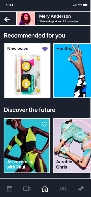
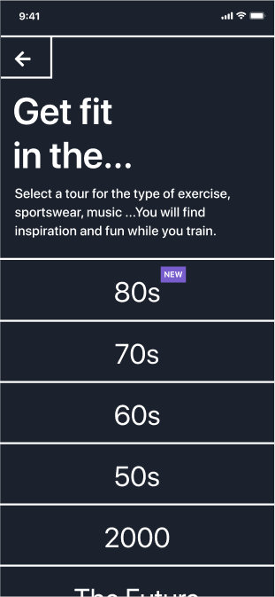
If we ask our users to be in continuous movement, GYM ROUTE moves with them. My objetive was to create an app that transforms and surprises with different seasons where we will go through the 70's, the 80's... A journey through the type of exercise, sportswear, music, food and even makeup. You will find inspiration and fun while you train.
My role
Brand strategy and guidelines, visual identity and UX/UI. Design system development.
-----------------------
Brand guidelines
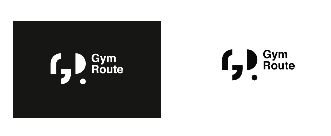
01| The logotype
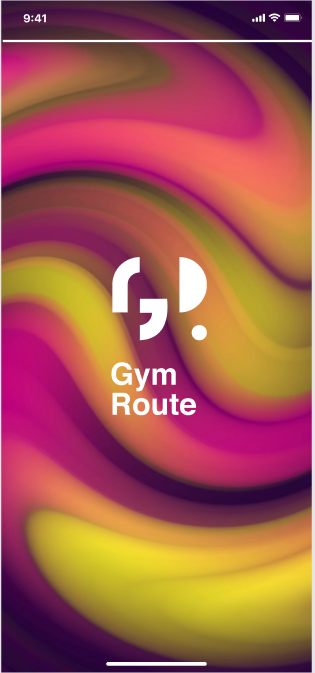
Composed of the G+R, which merge together to give dynamism. The R is formed by a dot and is where the reference of the season on which the content is focused is marked. The visual identity is clear and allows its integration in an app where the content has a very powerful visual.
02| Color application: The 80's
Vibrant, striking colors to represent an era; the 80's.
Visual identity
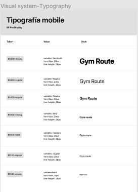
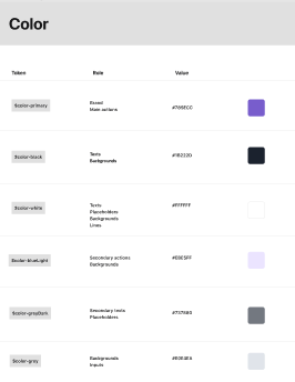
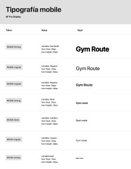
The logo, typography, color palette... are the main brand elements that provide visual communication with the user. For Gym Route, I created a unique mix of these elements to generate impact, fun and inspiration for the user.
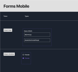
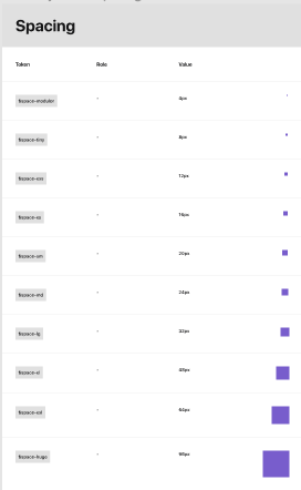
Design System
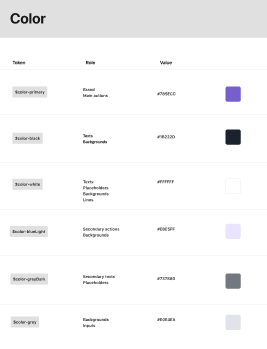
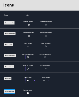
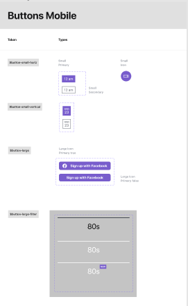

Prototype
Onboarding
Filter
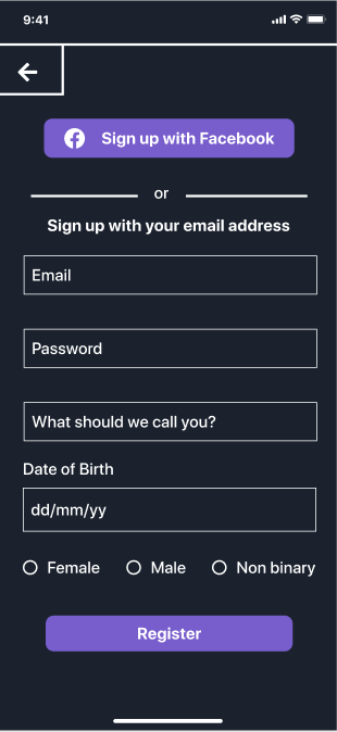
Register
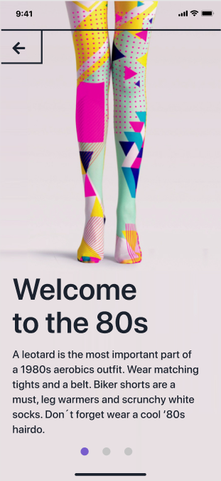
Onboarding
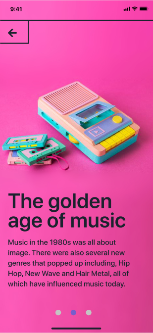
Onboarding
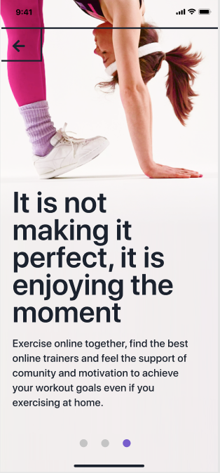
Onboarding
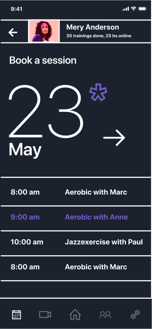
Calendar
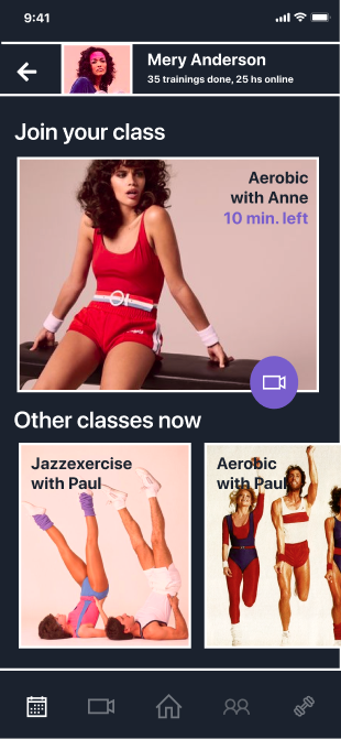
Notice
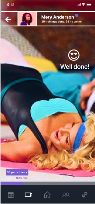
Streaming
